Why rug colours shift in photos, and how to keep them true
Why rug colours look different in photos and what to do about it: light, phone settings, a neutral reference and a simple check before you upload.
Drafted with AI assistance from Larina's own guides and the sources listed, then checked by automatic quality rules.
This article is available in English only.
Ask an AI assistant about this article
Open ChatGPTOpen PerplexityOpen ClaudeOpen CopilotOpen Gemini
These links only open the service. Some may fill the request in; if the box is empty, paste it.
Quick answer
Rug color accuracy in photos depends on three things: steady light of one kind, a camera with its filters switched off, and a check against the real rug before you upload. Colours shift because bulbs, window light, pile direction and phone processing all pull them in different directions. Control the light, keep a white reference in the frame, and correct from that reference rather than by eye, so the rug a customer unrolls looks like the one they chose.
What does true colour mean for a rug listing?
True colour means the photo on a buyer's screen matches the rug in ordinary daylight. It does not mean the brightest or richest version of the rug.
A buyer judges the rug against their sofa, their walls and their floor. If the photo shows a warmer red or a deeper blue than the rug really has, the rug can feel wrong the moment it is unrolled. That gap is something a seller can close before the listing goes live.
Think of the listing photo as a promise. It should show:
- the field colour, the large central area of the rug
- a border colour, which is often a different dye
- overall brightness, so a pale rug does not look dark or a dark rug look washed out
- pile texture, so the colour reads as wool or silk rather than flat print
You cannot control every buyer's screen. You can control what goes into the photo, and that is where most of the work pays off.
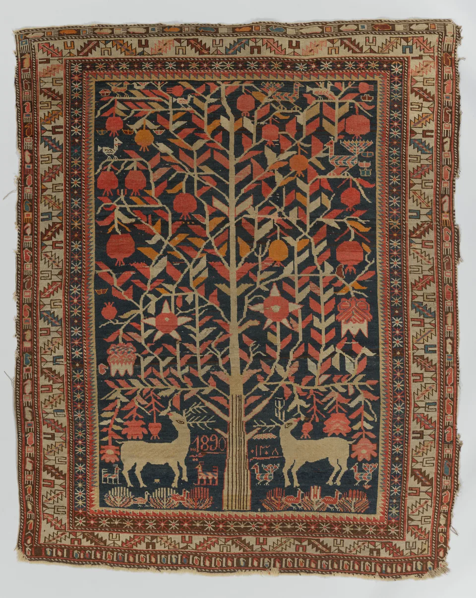
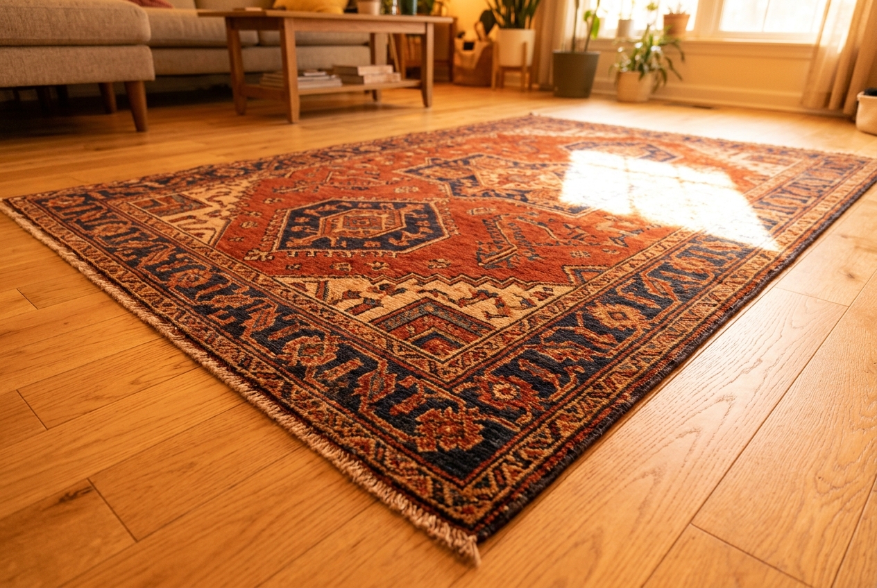
Museum images like this one are a useful reminder of how much detail lives in a single field colour. Small shifts in tone change how the whole design reads.
Why do colours shift between the rug and the screen?
Colours shift because light, pile and the camera each change what gets recorded. None of them is wrong on its own, but together they can move a colour a long way.
Light sources pull in different directions. Indoor bulbs often lean warm and yellow. Window light on an overcast day leans cool. The camera's automatic settings try to guess what white should be, and that guess changes as you move around the room. Mix two kinds of light and the camera cannot satisfy both, so part of the rug ends up tinted.
Pile reflects light by angle. Wool and silk fibres lean in one direction. Stand at the end the pile leans towards and the rug often looks darker and richer. Stand at the other end and it can look lighter and shinier. The same rug can look like two different rugs.
Phones apply their own processing. Phone cameras adjust the image after you press the button. The result may look pleasing on the phone screen and still differ from the rug on the floor. The only way to know is to compare.
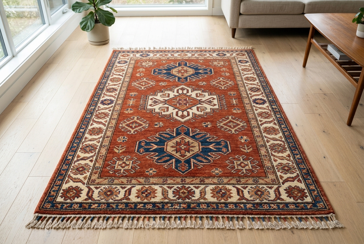
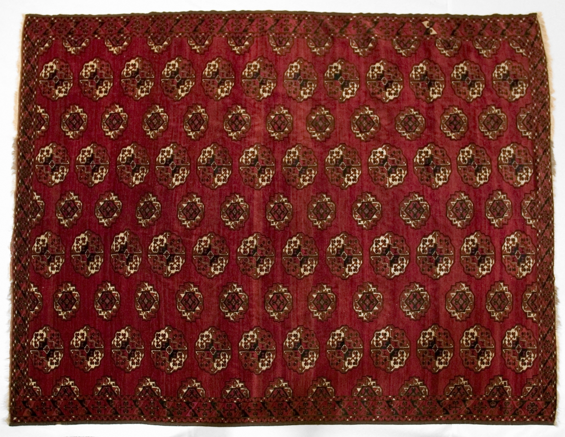
Side by side, the two illustrations show the difference in principle: a steep angle and warm light change both the colour and the apparent texture.
Which light gives the truest rug colours?
Soft, even daylight from a large window gives the most faithful colour for everyday rug photography. The key is one kind of light, not more light.
Place the rug near a big window, but out of direct sun. Direct sun throws hard bright patches and deep shadows across the pile. Overcast days are often easier, because the light is already soft.
If you have no good window, use a single type of lamp and switch off every other light. A room lit by one consistent source is easier to correct than a bright room lit by three different ones.
The textile conservation catalogue from the American Institute for Conservation advises that photographs should be taken in ambient lighting, and in other lighting situations to show particular information [3]. It also lists the type of illumination, placement and level of lights as details worth recording [3]. That habit helps a seller too. Note where you shot and with which light, so you can repeat it.
For more on this topic, see our article: How to photograph a rug for product photos.
How should you set up before you shoot?
Most colour problems are solved before the first photo. A few minutes of setup saves an hour of editing.
Choose your light. Shoot near a large window, or with the room lights off and one steady source on. Do not mix daylight with warm bulbs. If a lamp is on in the corner, turn it off, even if it seems too weak to matter.
Switch off filters. Open your phone's camera settings and turn off any vivid, warm, beauty or scene filter. Some phones have a setting that changes colour style. Set it to the most neutral option available.
Add a white reference. Lay a plain sheet of white paper at the edge of the frame. It should sit in the same light as the rug. You will use it later to correct white balance, then crop it out.
Prepare the rug. Lay it fully flat. Smooth out ripples so light falls evenly across the surface.
Fix your position. Shoot from above or from a gentle angle, the same way for every rug. Decide which end you shoot from, so pile direction stays the same across your stock.
Here is a short checklist to run before each session:
- Only one kind of light in the room.
- Phone filters off.
- White paper in frame, in the same light as the rug.
- Rug flat, with no folds or ripples.
- Same camera position as your last batch.
Why does the viewing angle change the colour?
The angle changes which side of each fibre faces the lens, so it changes how much light bounces back. Pile behaves a little like brushed velvet.
Hold a hand-knotted rug up and run your palm across it. One way feels smooth and looks lighter. The other way feels rougher and looks darker. Your camera sees the same thing.
Low angles make this worse. The Conservation Wiki explains that with raking light, the surface topography and texture of the subject plane are emphasized through the creation of shadows [4]. It notes that this kind of light can amplify the appearance of indentations, undulations, inlays, textile weaves [4]. Light skimming across a rug at a low angle does the same to pile. It is great for a close-up that shows texture. It is a poor choice for the main colour shot.
For your main image, light the rug evenly and shoot from above or nearly above. Save low, skimming light for one detail image, labelled as a texture shot, so buyers do not read its shadows as colour.
How should you handle rugs before the shoot?
Handle rugs gently and lay them flat before shooting, so creases and damp do not distort colour or shape. Preparation affects colour more than many sellers expect.
Folded rugs come out of storage with sharp creases. Each crease catches light differently and can read as a stripe of darker or lighter colour. The University of Delaware's art conservation team notes that carpets and rugs should not be folded as folds create weak points which will eventually wear and break [5]. The same team notes that it is preferable to roll rugs and carpets around a wide-diameter tube [5].
Damp is another problem. The same source warns that water damage can ruin colors and weaken supporting fibers [5]. A rug that is still damp after cleaning will also photograph darker than it looks dry. Let it dry fully before you shoot.
Storage conditions matter too. The source adds that excessive levels of temperature and relative humidity can cause accelerated deterioration [5]. Keep stock somewhere stable, so the rug you photograph today still matches its listing next season.
Check the photo against the rug
Before you upload, put the photo on a screen next to the real rug, in the same light. This single check catches most colour problems.
Stand where you can see both at once. Look at the screen, then the rug, then the screen again. Do not judge from memory, because the eye adjusts quickly and forgets.
Check the field and the border separately. A rug often uses different dyes in the field and the border. One can be right while the other is off. A deep red field might look correct while a pale ivory border has turned yellow. Cover one area with your hand on the screen and judge the other on its own.
Check the white paper. Look at the paper in the photo. If it looks yellow, orange, blue or green, the whole photo carries that tint.
Correct from the reference, not by feel. If a colour is off, open your editing app and use the white balance tool. Most apps have a dropper you can tap on a neutral area. Tap the white paper. The app then shifts the whole image so that paper reads as neutral, and the rug moves with it.
Resist the saturation slider. It makes colours louder or quieter, but it does not fix a tint. A rug with a warm cast and more saturation is still the wrong colour.
For more on this topic, see our article: Rug photography, from one flat photo.
How do you correct white balance without overdoing it?
Make one correction from the white paper, then stop and compare with the rug again. Small, single adjustments are safer than many stacked ones.
After you tap the paper, look at the rug on screen next to the real rug. If it matches, crop out the paper and you are done. If it still looks a little off, adjust temperature or tint by a small amount, then compare again.
A few habits help:
- Edit on the same screen each time, so your judgement stays consistent.
- Keep the screen brightness the same during editing.
- Avoid editing late at night with a warm night mode turned on, as it changes how you see colour.
- Save the original photo, so you can start again if an edit goes too far.
If two people edit your photos, agree on one screen and one routine. Two people correcting by eye on different devices will drift apart over time.
When you are unsure, compare with the rug in daylight. The rug is the reference, not the photo you edited yesterday.
What goes wrong, and how do you fix it?
Most colour faults come from mixed light, wrong angles or heavy editing, and each has a simple fix. The table below gives a quick reference.
| Problem | Cause | Fix |
|---|---|---|
| Whole photo looks orange or yellow | Warm bulbs on, or mixed with daylight | Turn off bulbs, shoot by one window, correct from the white paper |
| Photo looks blue or cold | Shade or overcast light with auto white balance | Correct white balance from the white paper |
| Half the rug looks a different colour | Two light sources hitting different areas | Use one light source only |
| Rug looks shiny or washed out | Pile facing the light, or a steep angle | Shoot from the other end or from above |
| Colours look louder than the rug | Vivid filter or saturation raised | Turn off filters, reset saturation |
| Dark stripes across the field | Fold creases catching light | Roll, flatten and let the rug relax before shooting |
| Border looks off but field looks right | Different dyes reacting to light differently | Check field and border separately, then reshoot if needed |
If a fault keeps coming back, change the setup rather than editing harder. A better spot by the window often fixes what no slider can.
When should you reshoot instead of editing?
Reshoot when the light was mixed, when glare covers part of the rug, or when the field and border cannot both be corrected at once. Editing cannot rebuild information the camera never captured.
A bright glare patch is a good example. The pile there has turned to white, and no adjustment brings the colour back. A rug lit half by a window and half by a warm lamp is another. Correct one half and the other goes wrong.
Reshooting is often faster than you expect. Your spot, your paper and your phone are already set up. Move the rug, switch off the stray light, and take the shot again.
Keep the faulty version for a moment and compare it with the new one. You will start to see what your room does to colour, and you will catch problems sooner next time.
How do you keep colour consistent across a catalogue?
Use the same spot, time of day and phone for a whole batch, and name each file by SKU. Consistency makes your listings look like they belong together.
Same spot. Mark the place on the floor where rugs lie, and where you stand. Tape works well.
Same time of day. Window light changes through the day. Morning light and late afternoon light look different. Shoot a batch in one session, at roughly the same hour.
Same phone. Different phones process colour differently. Shoot a whole batch on one device.
Same white paper. Use the same kind of paper each time, so your reference does not change.
Name files by SKU. Rename each photo with the rug's SKU and a short view label, such as front, back or detail. Every image can then be traced back to its rug. If a buyer asks about colour, you can find the rug and check it against the exact photo.
The conservation catalogue recommends overall front and back views as well as details of damage [3]. For sellers, one back view is a simple extra: it gives buyers a second look at how the rug is made.
For more on this topic, see our article: Store-ready photos from one upload.
Where Larina fits
Larina's /features page lists "Room scenes, close-ups and clean shots from one photo", "A whole rug collection, queued in one go" and "Finished photos straight to your product pages" [1]. Larina's monthly plans start at $49 for 50 photos a month (Pro) [2]. Unused Larina credits do not expire [2]. A true-colour source photo is still the best starting point.
Final takeaway
Colour shifts in rug photos come from light, angle and the camera's own processing. You can control all three before a listing goes live.
Shoot with one kind of light, ideally soft daylight from a large window. Turn off phone filters. Put a sheet of white paper in the frame and correct white balance from it, not with the saturation slider. Lay the rug flat, keep a steady angle, and shoot from the same end every time so the pile reads the same way.
Before you upload, hold the screen next to the rug in the same light. Check the field and the border separately. If glare or mixed light has spoiled part of the image, reshoot rather than edit.
For a whole catalogue, keep the spot, the time of day and the phone the same, and name every file by SKU. These habits are simple. They help each buyer see the rug they will actually receive.
Frequently asked questions
Why does my rug look warmer in photos than in real life?
Warm indoor bulbs are the usual cause, often mixed with daylight. Switch off room lights, shoot by one window, and correct white balance using a sheet of white paper in the frame.
Can I fix rug colour with the saturation slider?
Not really. Saturation makes colours stronger or weaker but does not remove a tint. Correct white balance from a neutral reference first, then compare with the real rug.
Why does the same rug look lighter from one end?
Pile fibres lean in one direction. From the end the pile leans away from, the fibres reflect more light and the rug looks paler; from the end it leans towards, it looks darker. Shoot every rug from the same end so your listings stay consistent.
Should I photograph the back of the rug?
Yes, if you can. One back view gives buyers a second look at how the rug is made, next to the front views that show its colour.
Does a grey card work better than white paper?
Either can work as a neutral reference. What matters most is using the same reference every time and placing it in the same light as the rug.
How often should I check my photos against the rug?
Check every main image before upload. It takes a moment and catches problems in both the field and the border before a buyer sees them.
Sources
- Built for products where every detail matters (larina.ai): https://larina.ai/features
- Pricing (larina.ai): https://larina.ai/pricing
- Textile Conservation Catalog, Chapter IV, Section E: Photographic documentation (American Institute for Conservation, Textile Specialty Group): https://www.conservation-wiki.com/wiki/TSG_Chapter_IV._Documentation_of_Textiles_-_Section_E._Photographic_Documentation
- Raking light (American Institute for Conservation, Conservation Wiki): https://www.conservation-wiki.com/wiki/Raking_light
- Attics and Basements and Closets, Oh My! Part 7: Rugs and Carpets | Art Conservation Resources (artcons.artsci.udel.edu): https://artcons.artsci.udel.edu/?p=956